
Did you happen to catch Private Practice star Kate Walsh's 1920s Los Feliz home in People Magazine a couple of weeks ago? If it looked familiar to you, it might be either because you and Kate hang on the weekends, or because you saw the same pad featured in InStyle Magazine back in 2009.
The 1920s Spanish style home has been on and off the market in the wake of the end of Walsh's blink-did-you-see it marriage. Between People, InStyle, and the MLS listings, there are plenty of photos of the spread, and it's interesting to compare how the same rooms have been staged and styled differently.
In the understated dining room, Walsh experimented with a variety of tables in various shapes and sizes. The first strikes me as way too massive and cold, and you'd need a conveyer belt to pass the salt to your good friend across the table (no playing footsy here).

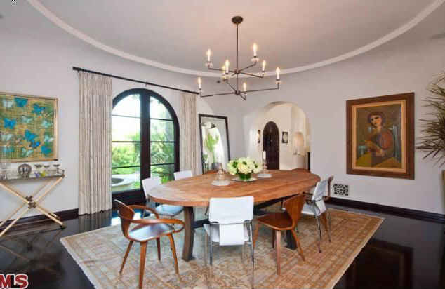
This one, while cozier, seems a bit too diminutive, particularly in relation to the size of the chandelier. And I really dislike the white chairs which strike me as too contemporary (and too bright) as they relate to the gorgeous rug.
Love this table as a compromise, with the circular wooden base cutting the cold edges of the glass square table top...

The living room has endured a change in carpet, and several changes in layout (who doesn't love rearranging their furniture when they get bored?). In the first shot, the furniture feels a little "top heavy" to me against the back wall. I LOVE this coffee table, but it's weird to have the three low pieces (side table, coffee table, ottoman) in such close proximity.

Hey, where did the overhead lighting fixture go? I liked it! I do prefer the two facing couches layout - feels more balanced - but I miss the old coffee table.

Best layout yet! Moving the baby grand to the left helps balance the heft of the sofa. The professional styling and lighting by the folks at InStyle aren't hurting things, either.

Oooh the ceiling fan. Ugly as heck, but practical in LA no doubt. You won't catch that sucker in InStyle for sure, and notice how realtors photograph it powered on, to diminish the unsightliness of the blades. What a beautiful and serene room otherwise, right?


I do prefer the contemporary lines of the Barcelona-esque corner chair in the InStyle shot below to the chair in the MLS photos. Just a little edgier to match the vibe of the stunning agate lamps and Walsh's brother's abstract artwork.

Have you done any furniture rearranging lately?
Deb
I like her style. Love that dinning room set!
ReplyDeletewww.flourishandfancy.com