
I just love the idea of using juxtaposition in interior design. There's a fine line, however, between creating an intriguing tension by using opposing styles or colors, versus creating a look that is mismatched and irrelevant.
Ideally, opposing elements should highlight one another, while retaining their own independent value. Here are some examples that I think work beautifully...


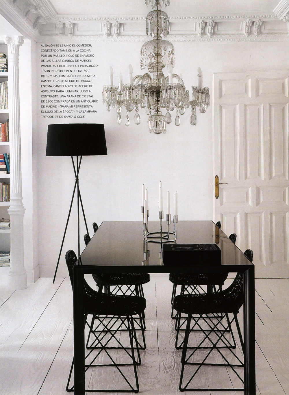
Juxtaposition - love it or leave it (or leave it to the experts)?
Deb
I agree that there is a fine line. I like the "collected" look, where everything feels like it belongs to the same person even though styles might be diverse.
ReplyDeleteI just had to laugh about the "sculpted wood pallet".
Check out the Main Line Philadelphia home in this month's Architectural Digest. The juxtaposition of modern art and gorgeous antique furniture is STUNNING.
ReplyDelete